A theatrical rebranding for CTORA Productions
CLIENT
CTORA Productions
Richmond, British Columbia
BACKGROUND
The Children’s Theatre of Richmond is broadening its repertoire to encompass not only children’s theatrical productions but also a range of captivating programs for training and children's camps, film ventures, and adult performances. In order to harmonize with its expanded range of services, the Theatre decided to rebrand itself as CTORA Productions, requiring a fresh identity that resonates with its evolving service offerings. Given that the production company has three divisions and a wide range of theatre productions, it was imperative that we develop an identity that could live along side myriad visual programmes.
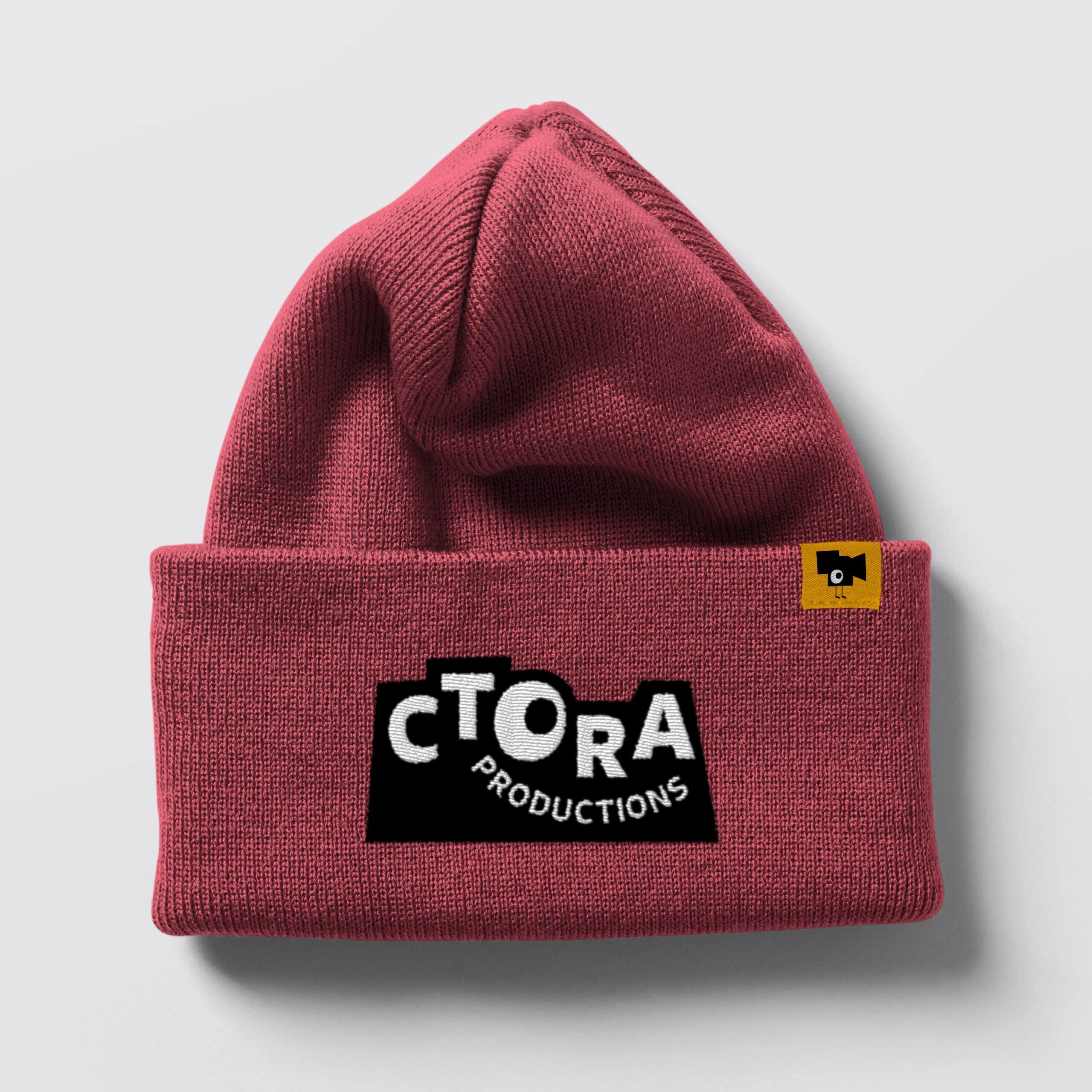
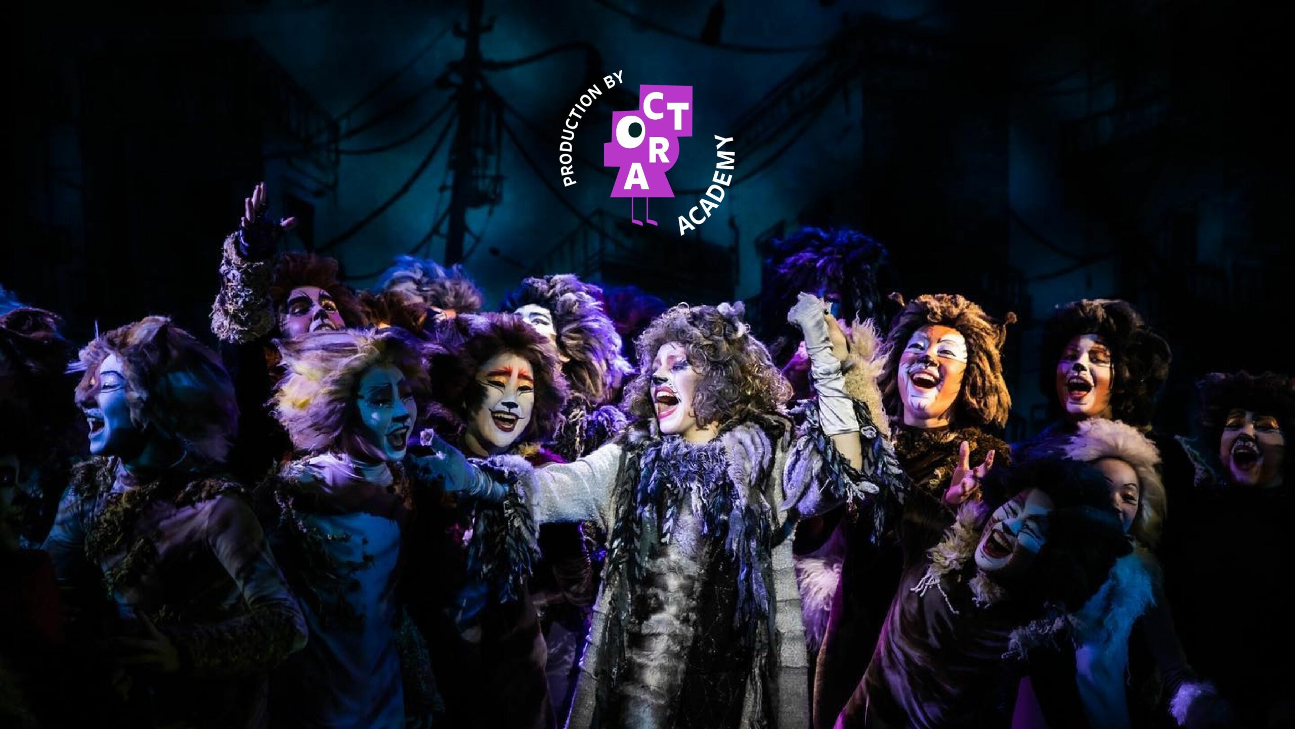
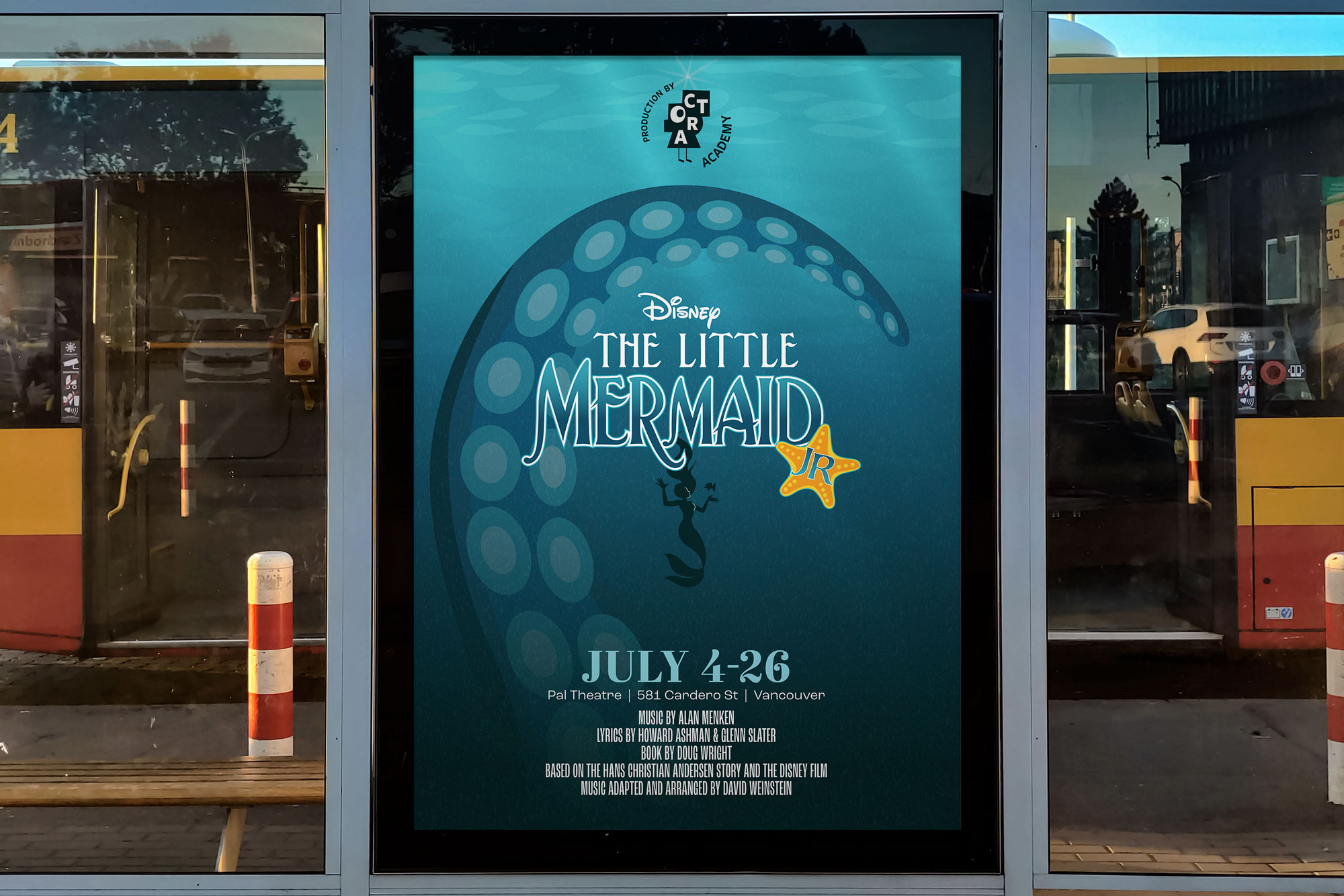
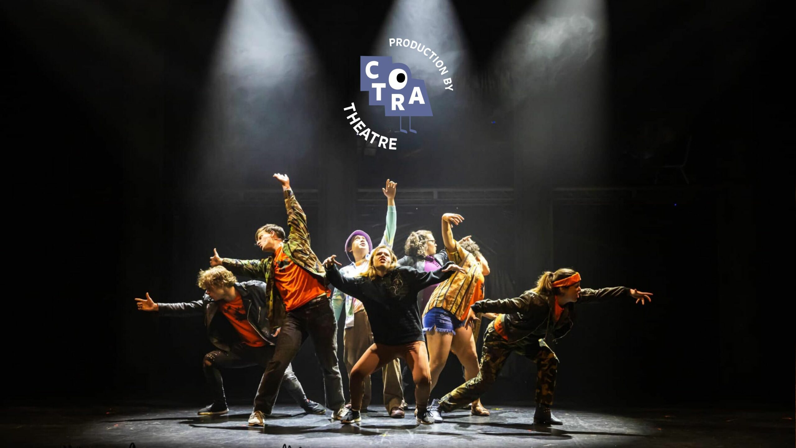
Three iconic characters to represent each division resulting in a flexible unique identity.
Inspired by stagecraft and the physical forms designed to create theatrical scenery, paper cutouts mimicking the shape of the CTORA letterforms were arranged to experiment with various shapes and overlapping silhouettes. These shapes are extended to create a family of logo characters called “The Sneak Peeks” to differentiate each division’s unique offering and embody its essence: Theatre is represented by stage stairs, Film by a camera, and Academy by a head.
The rebrand successfully communicates the diverse range of services and products offered by the Production company with a cohesive family of sub-logos that can be easily expanded upon in the future, creating a cohesive and scalable system. The new brand system seamlessly integrates into artwork and advertising and has proven to be playful and flexible. It effortlessly adapts to the unique character of each performance interacting with illustrations and a wide range of colour palettes.